Peroni Nastro Azzurro
True Italian Flair
Packaging
Production
Guidelines
Agency - Outlaw
Role - Creative Director
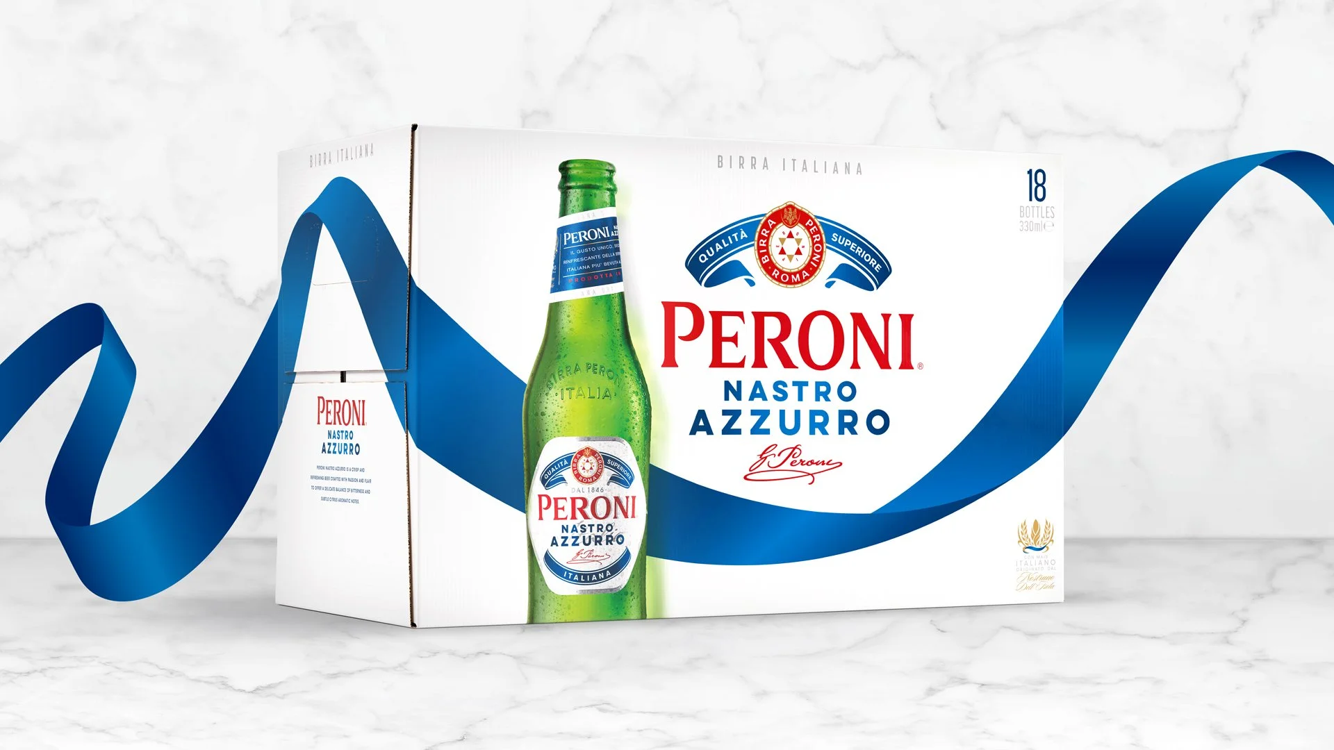
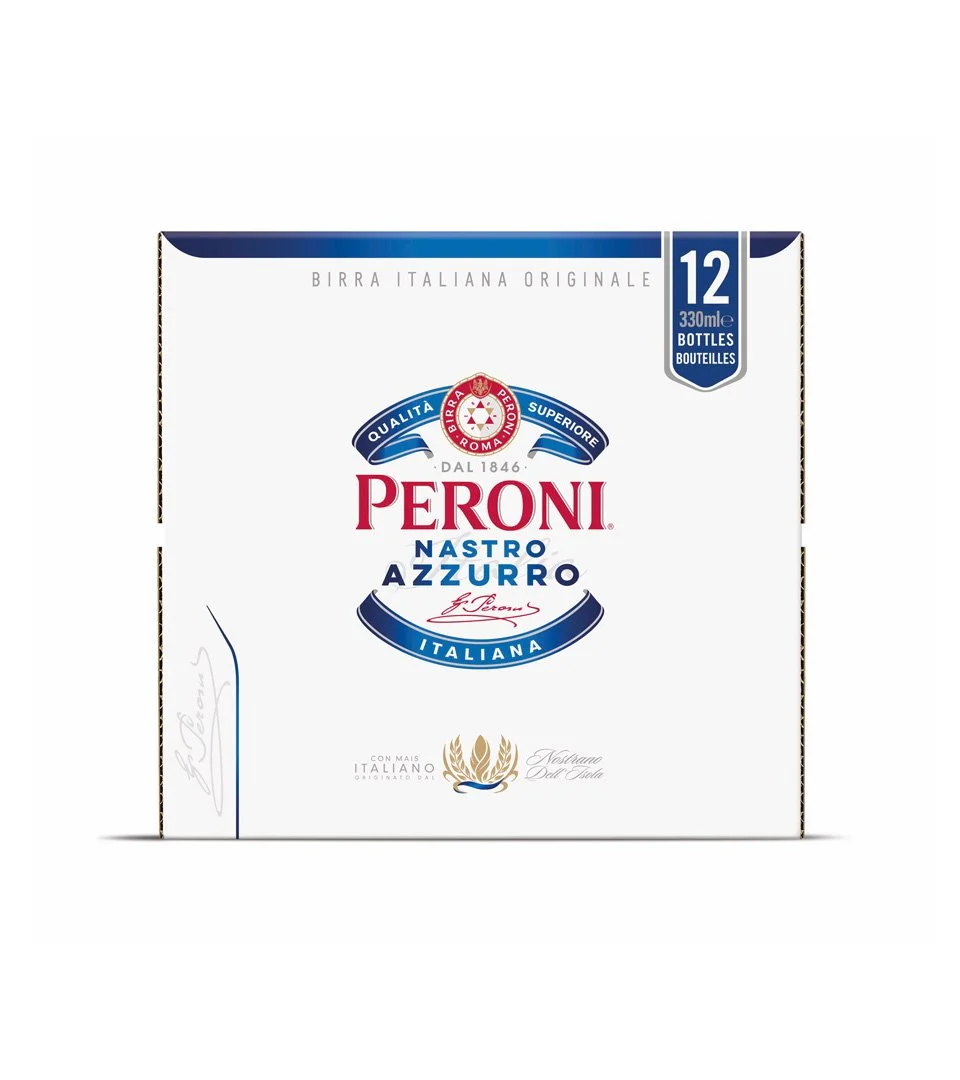
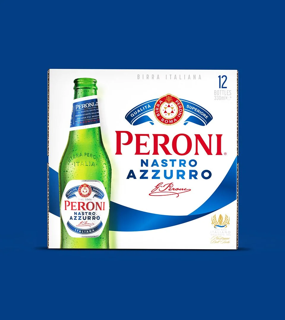
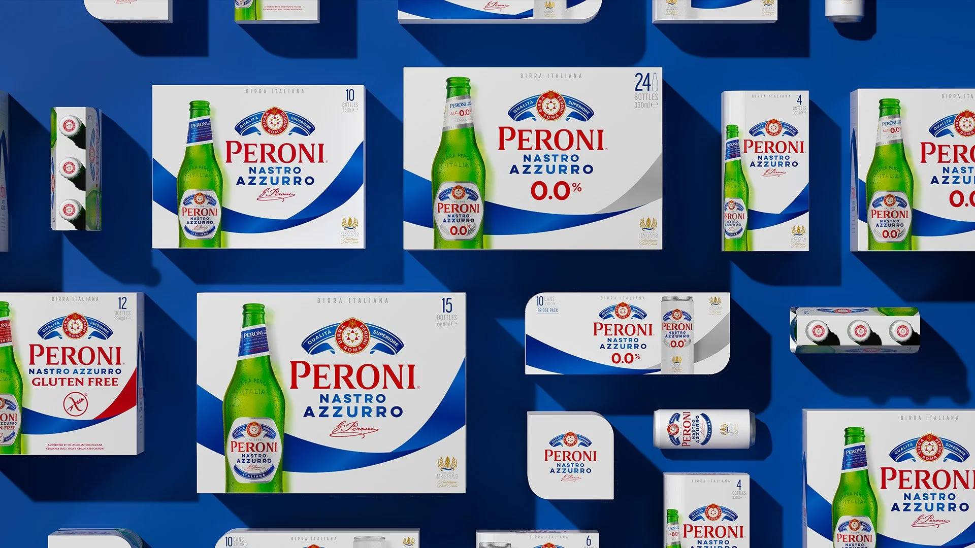
Peroni Nastro Azzurro elevates life’s moments with passion and flair in true Italian style. Challenging category conventions since 1963, the brand was aiming for Top 10 Global Beer status by 2030, with packaging a key driver for that growth.
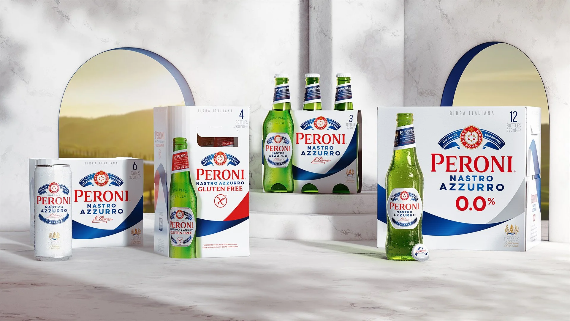
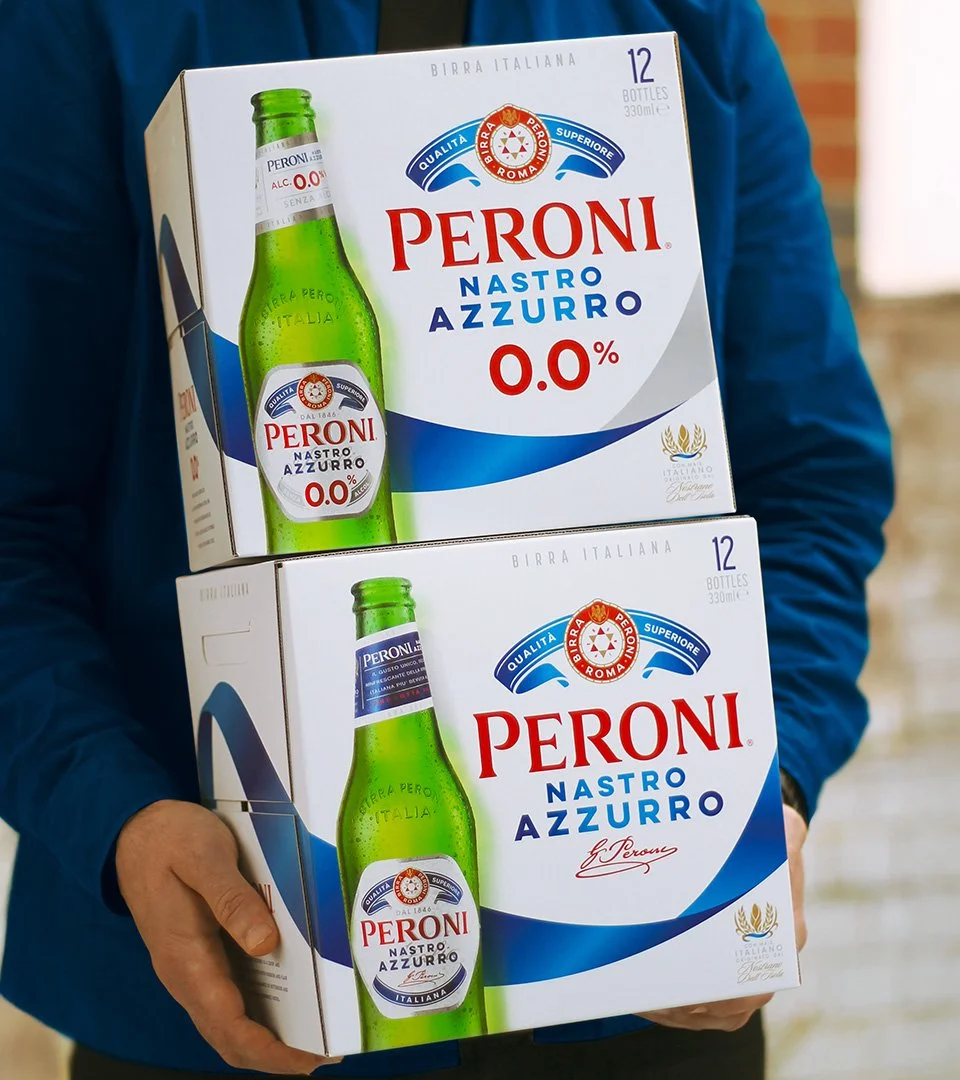
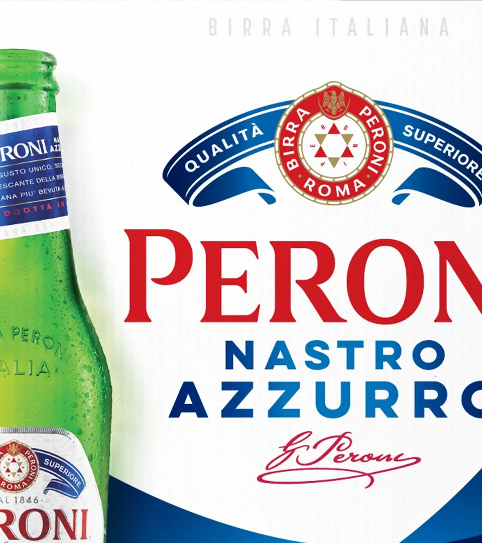
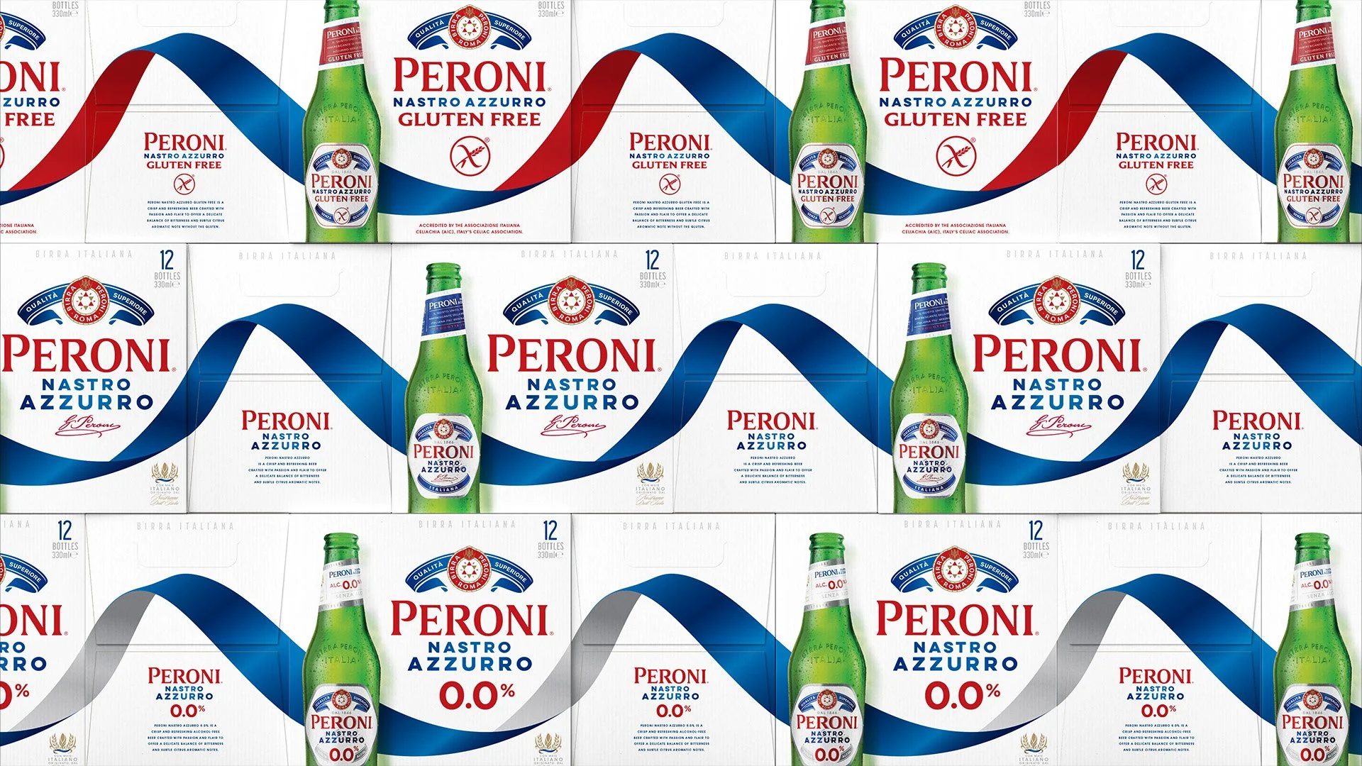
The design solution unleashes the brand’s key asset - the blue ribbon (‘Nastro Azzurro’). Sweeping across every canvas it embodies passion and flair while providing a distinctive shape and colour that’s unmissable in store. And wrapping all four sides of every pack format, the design creates an ‘endless ribbon’ wherever packs are seen together.
A creative challenge followed by the complexity of a global rollout, first extending the design to 0.0% and Gluten Free variants then building detailed guidance. The result is an impactful new design system that will bring more people into the brand more often, and contribute to its ambitious growth.
Images courtesy of Outlaw