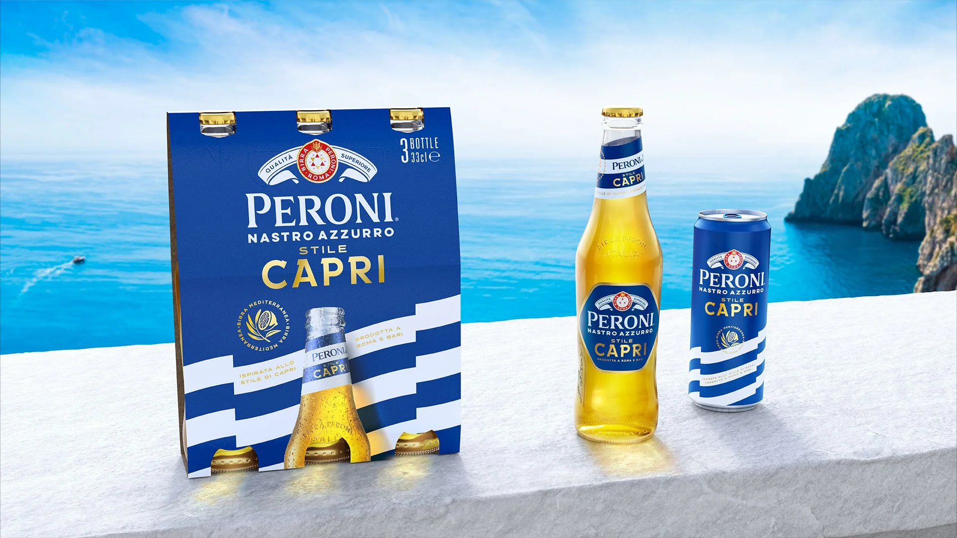
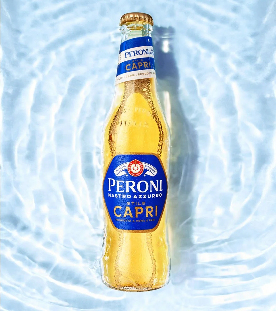
Peroni Capri
Taste of Italian Summer
Innovation
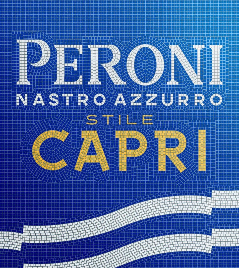
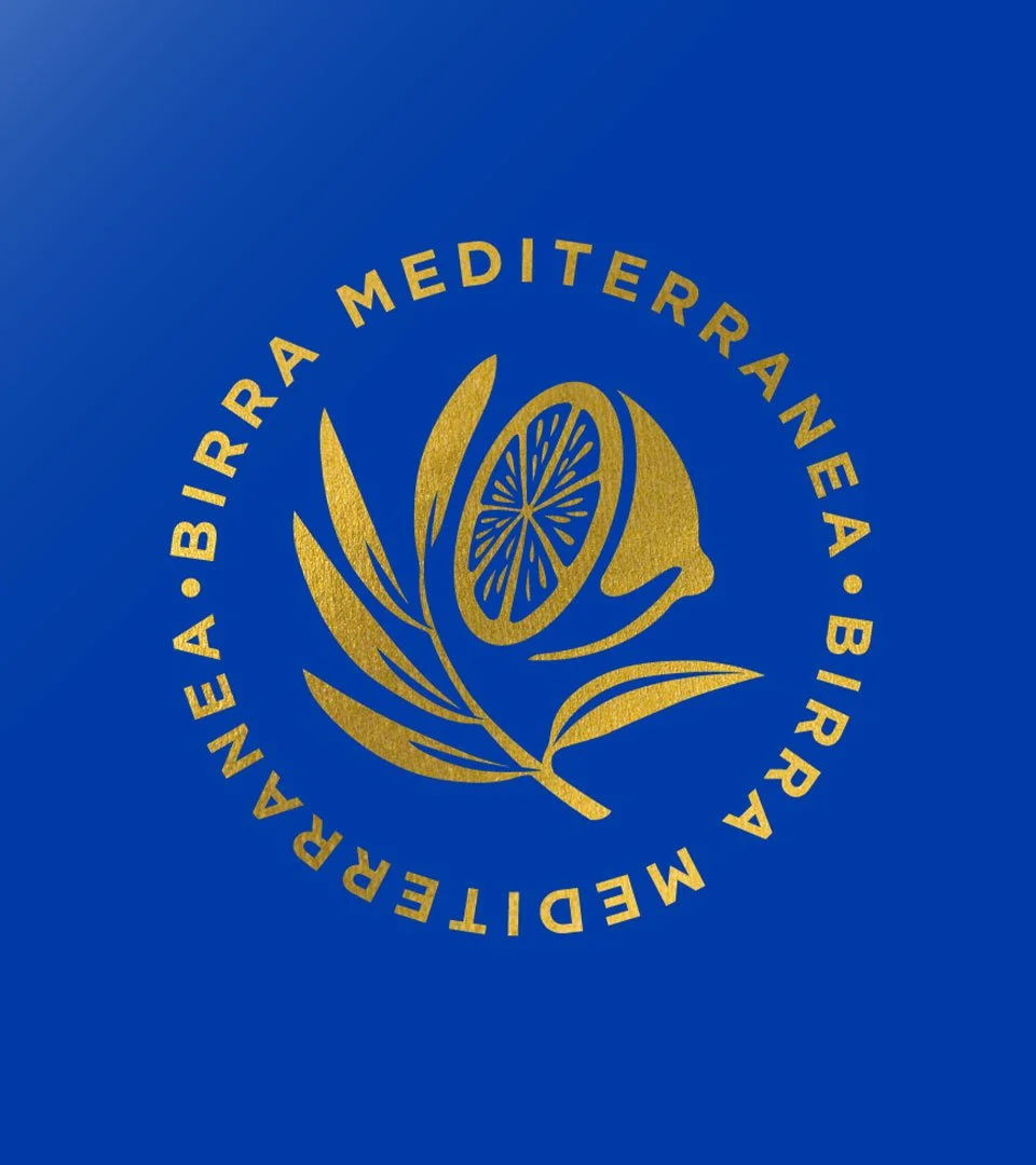
Identity
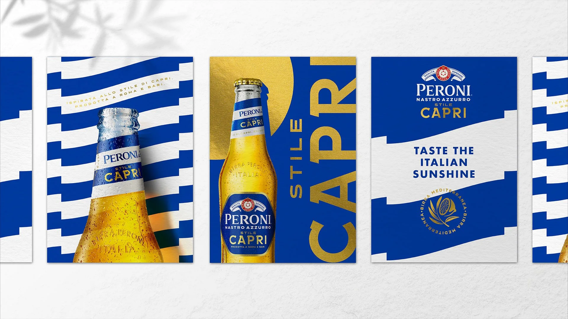
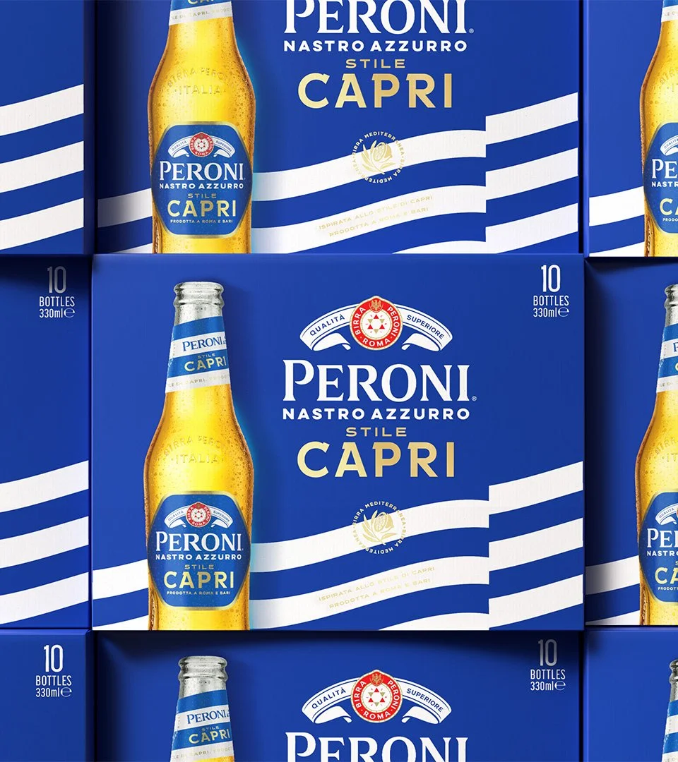
Packaging
Art direction
Activation
Agency - Outlaw
Role - Creative Director
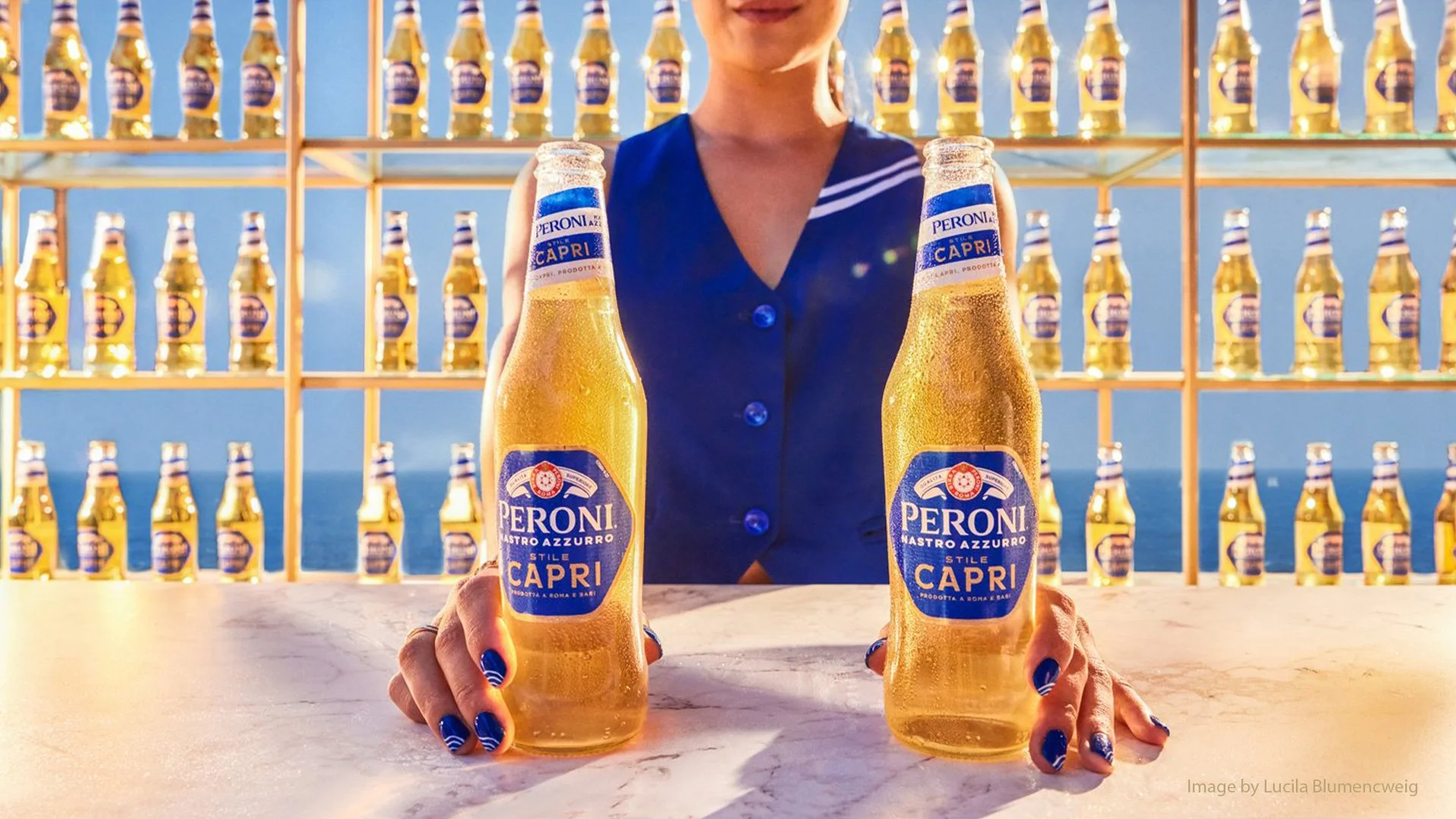
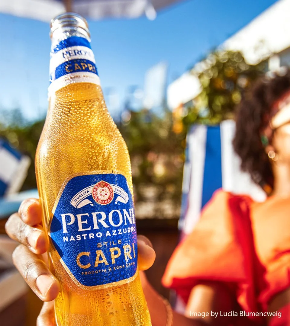
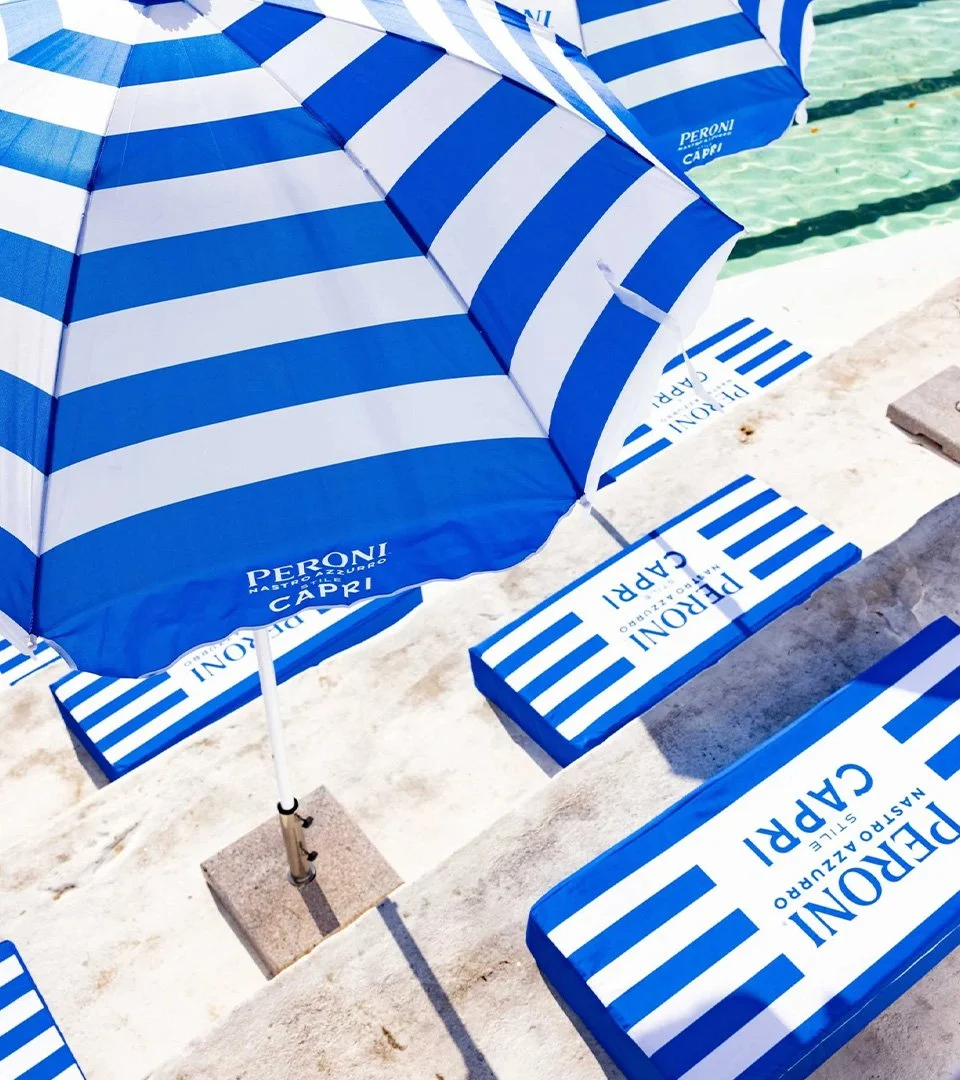
Peroni Capri was born to elevate ‘easy drinking’ lager from the beach and into the stylish terrace bar. Inspired by the Island of Capri, it represents Peroni’s boldest global innovation in years.
The concept was the result of a global innovation workshop, where consumer and category insights came together to shape the initial idea, through to liquid profile, naming, packaging and brand visual identity.
The azure blue is inspired by Capri’s electric blue waters and the vibrant mosaic tiles seen all over the island, while the graphic language is drawn from the iconic striped umbrellas that line the beaches.
Images courtesy of Outlaw