
Fuller’s
Outstanding Beer
Identity
Packaging
Brand World
Production
Agency - Outlaw
Role - Designer / Creative Director
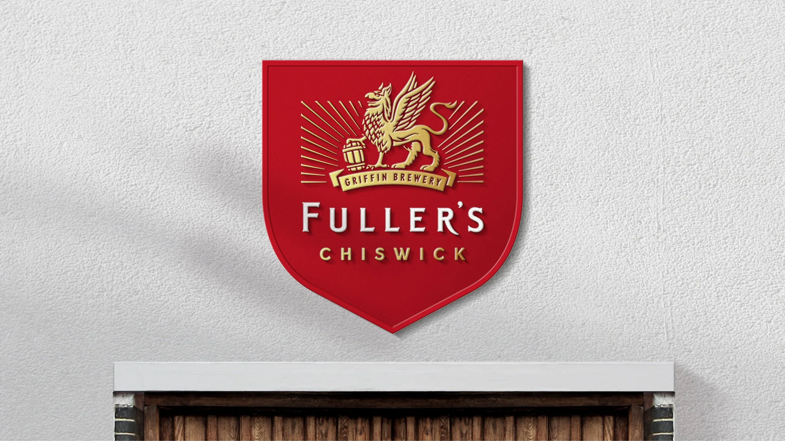
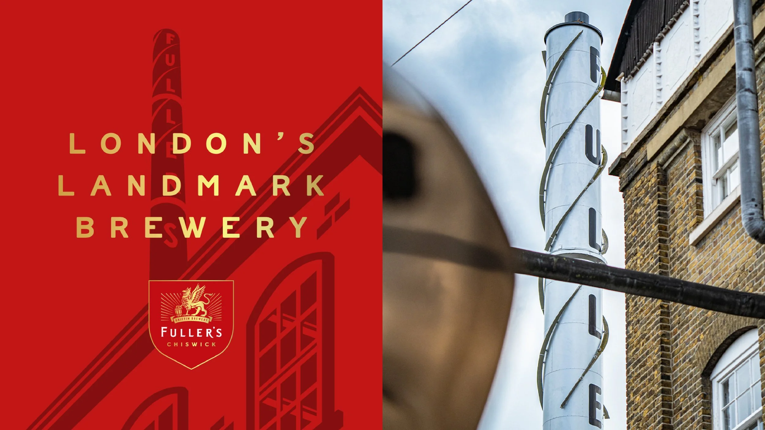
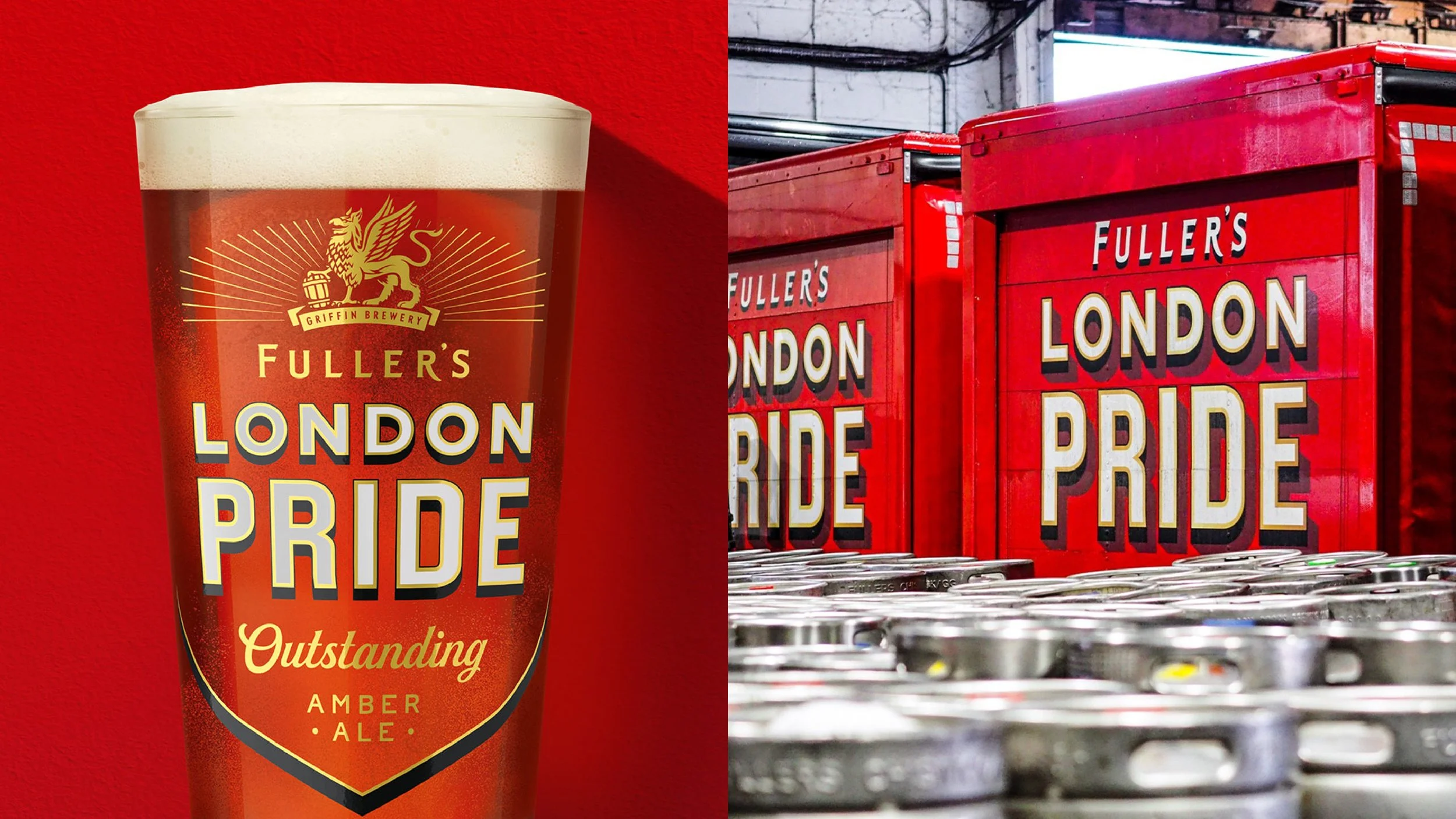
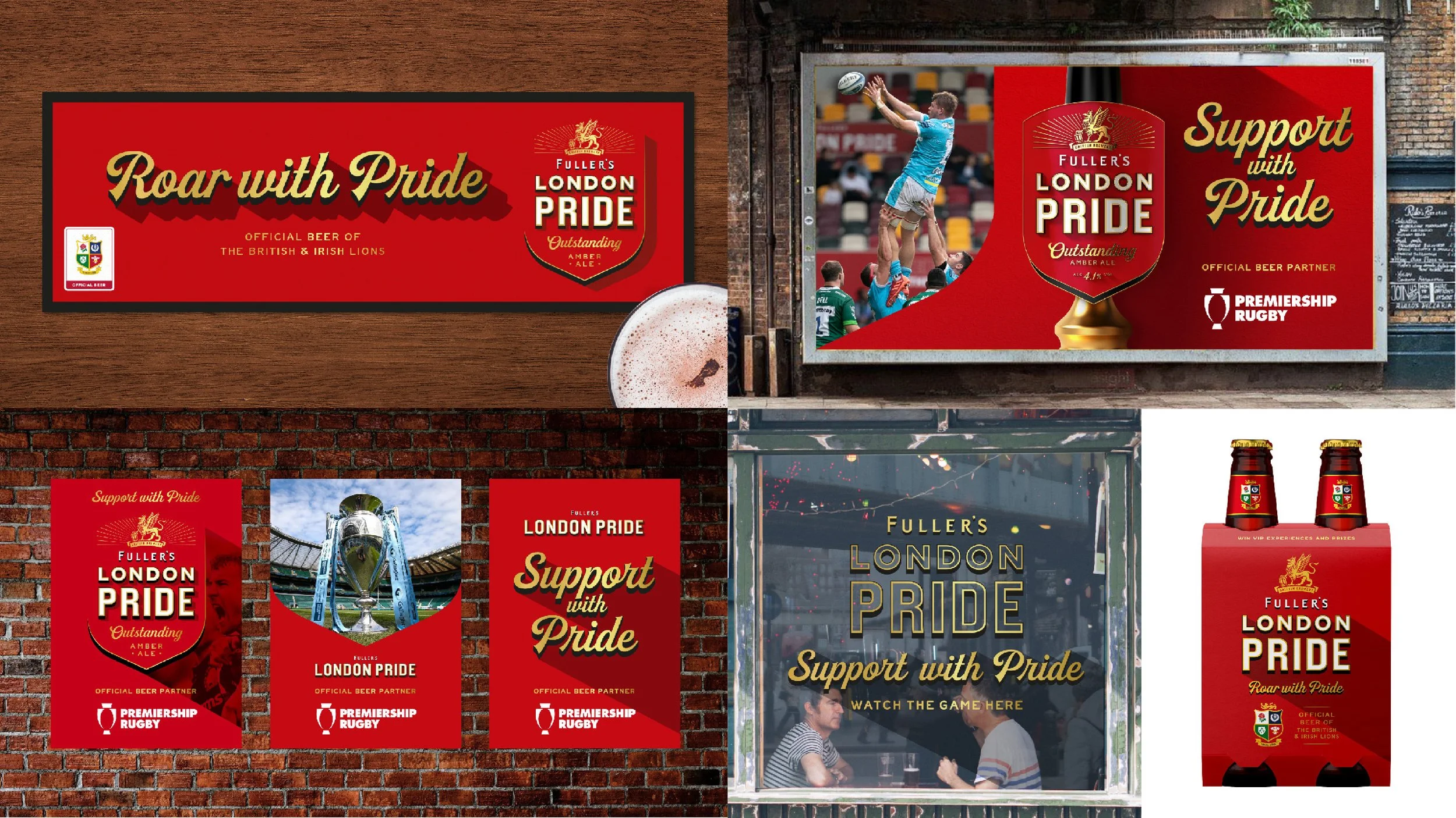
A refreshed identity for London’s first and greatest brewer, bringing modernity and storytelling. Establishing a visual language that would filter down to packaging.
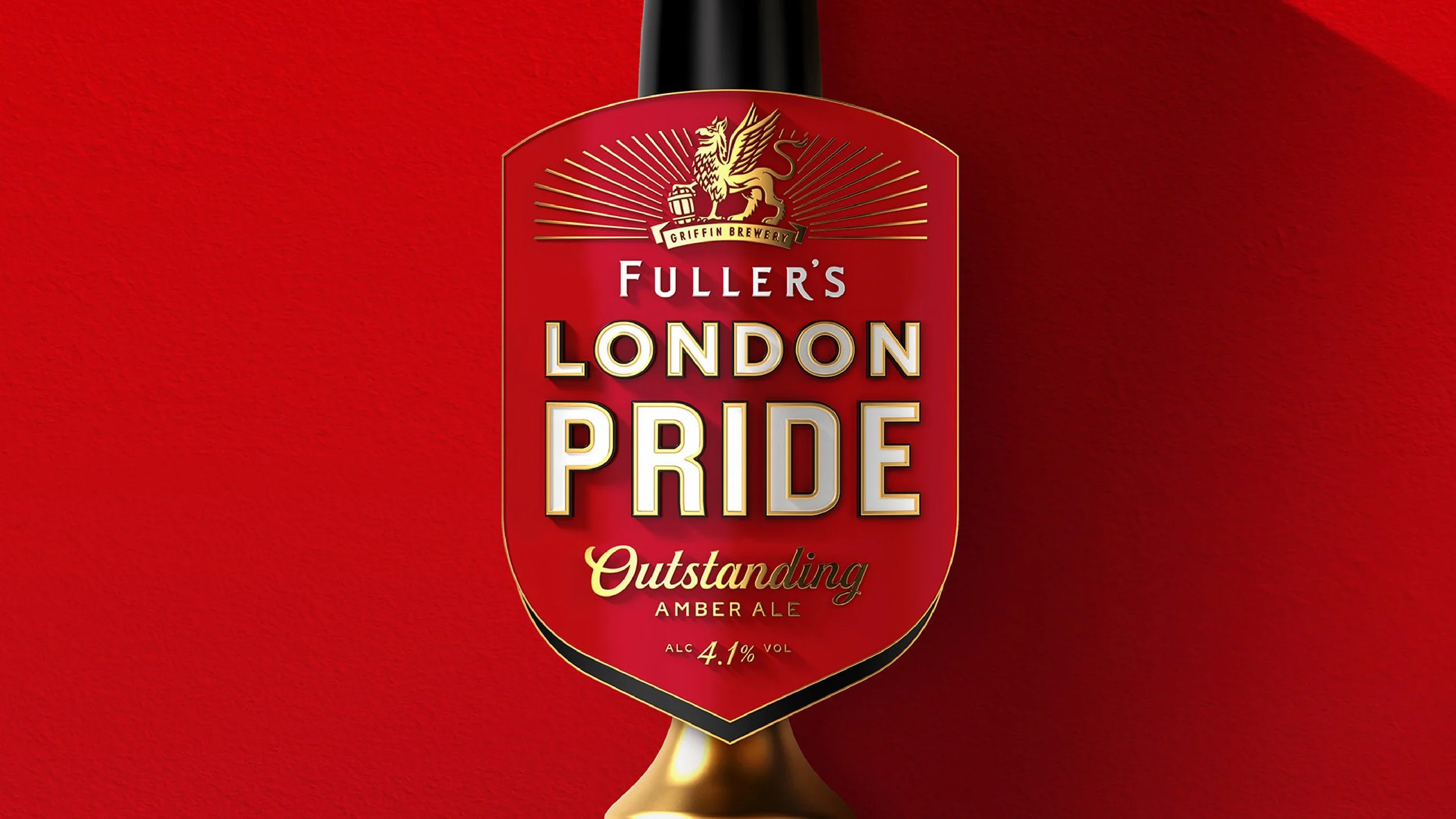
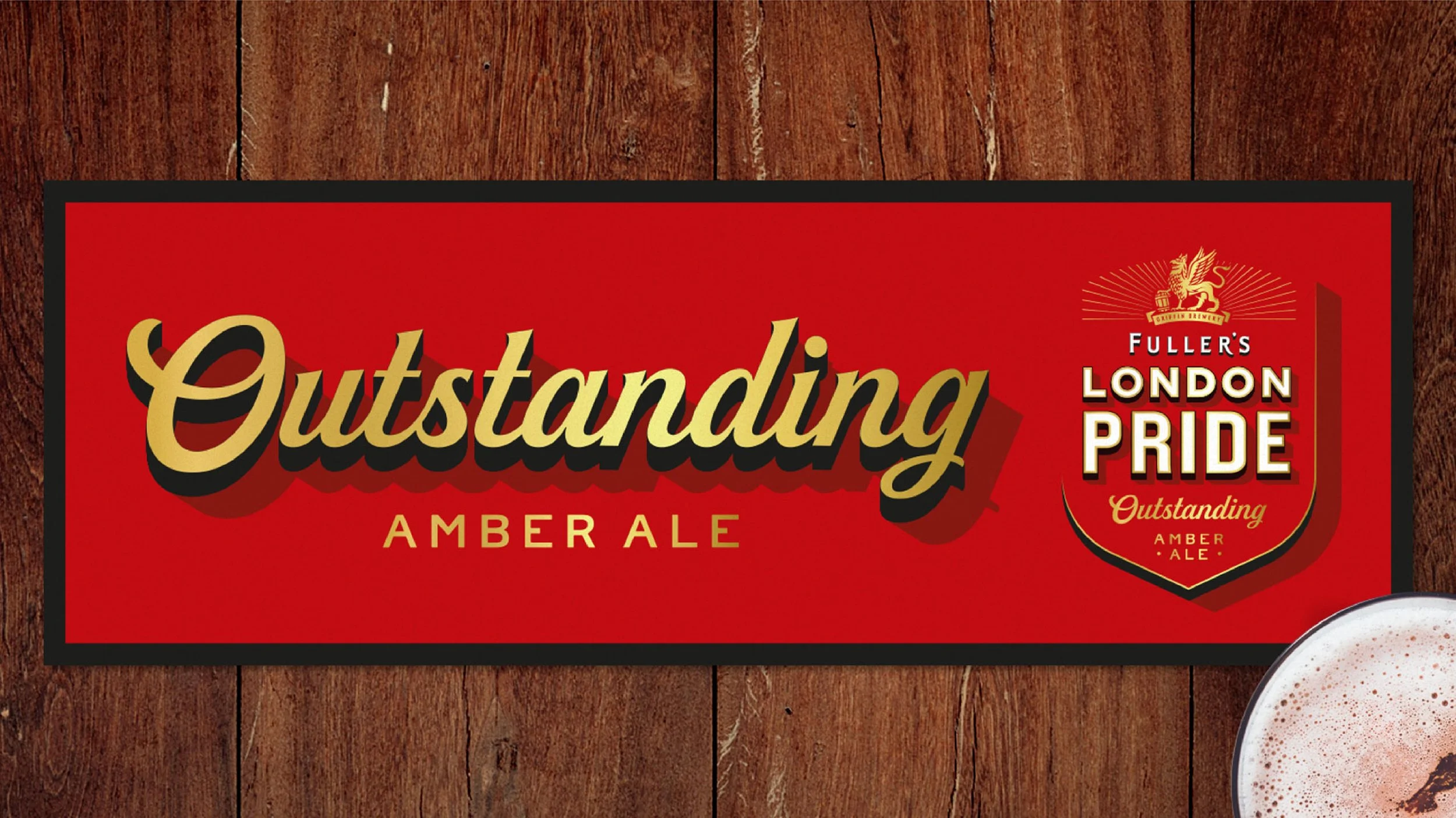
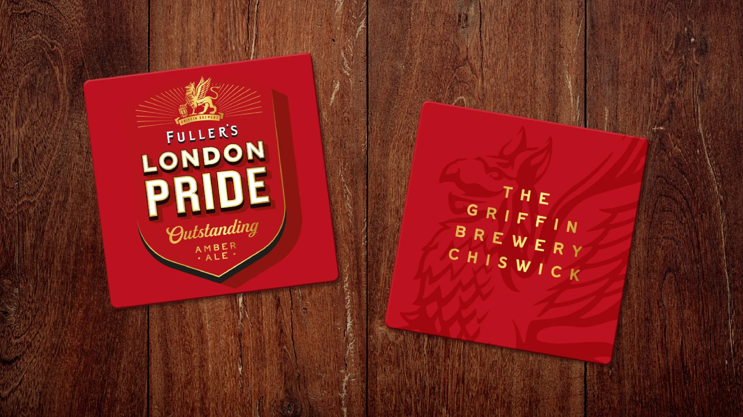
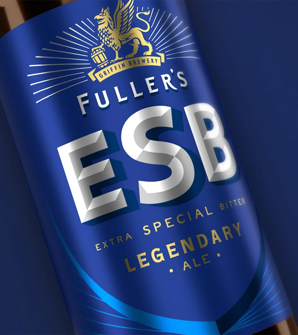
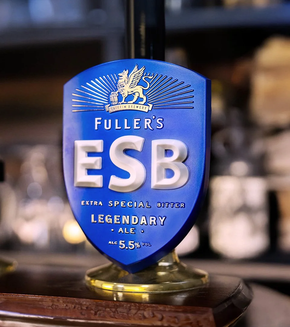
The shield device has always had a place in Fuller’s heritage, so became a consistent but flexible asset – shaped by the brewery’s position on the Thames for the masterbrand identity, with London Pride and ESB’s inspired by bevelled plaques found in the archive.
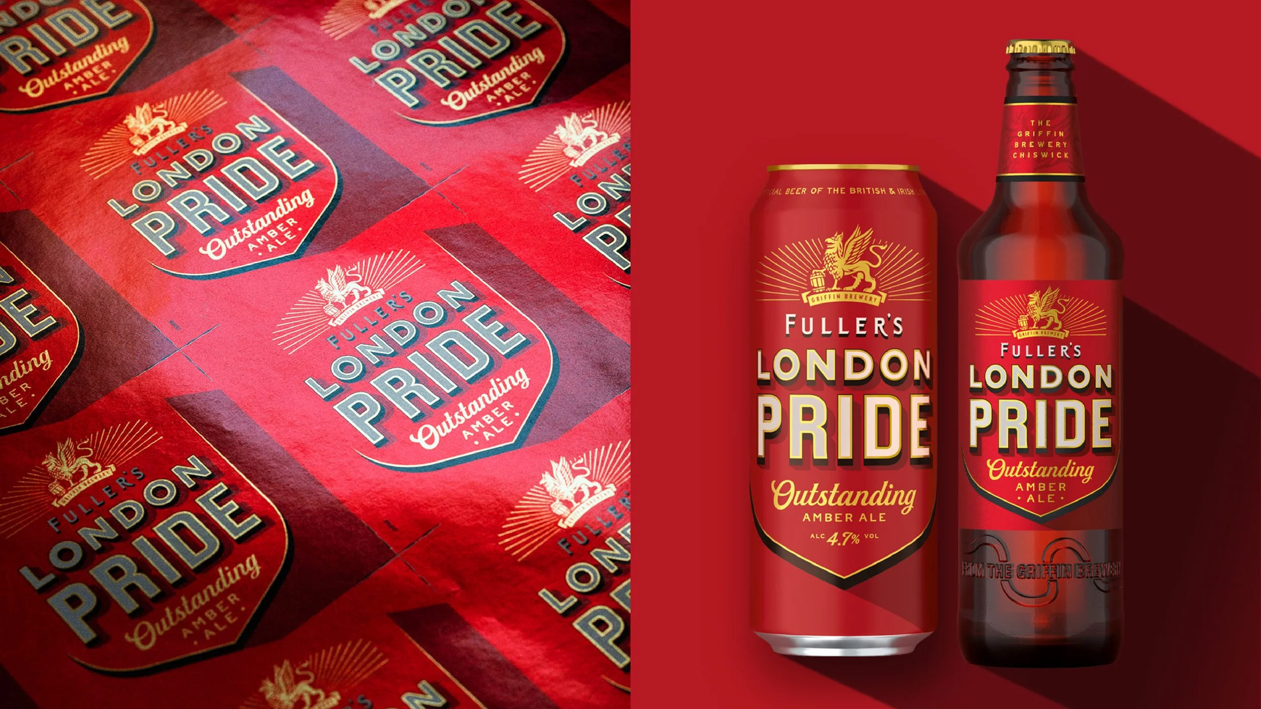
Typography played a key role, with London Pride inspired by the hand-gilded mirrors and windows of the iconic Fuller’s estate and the layered typography of London, while ESB adopts more weight and depth to match the full-bodied strength of the liquid.
The result is a Masterbrand identity that captures Fuller’s heritage with new lightness and modernity, and packaging that delivers distinct personality with a clearly shared DNA.

Images courtesy of Outlaw